Koala
Koala’s Customer Service team has been crucial to the success of the company. As new products are being introduced to the company, and it is no longer a “bed in a box” company, the CS team were getting swamped and were rapidly increasing their team size.
Our high level goals were to introduce new products, increase the conversion rate of existing products, and to improve the cross sell rate of products.
My role
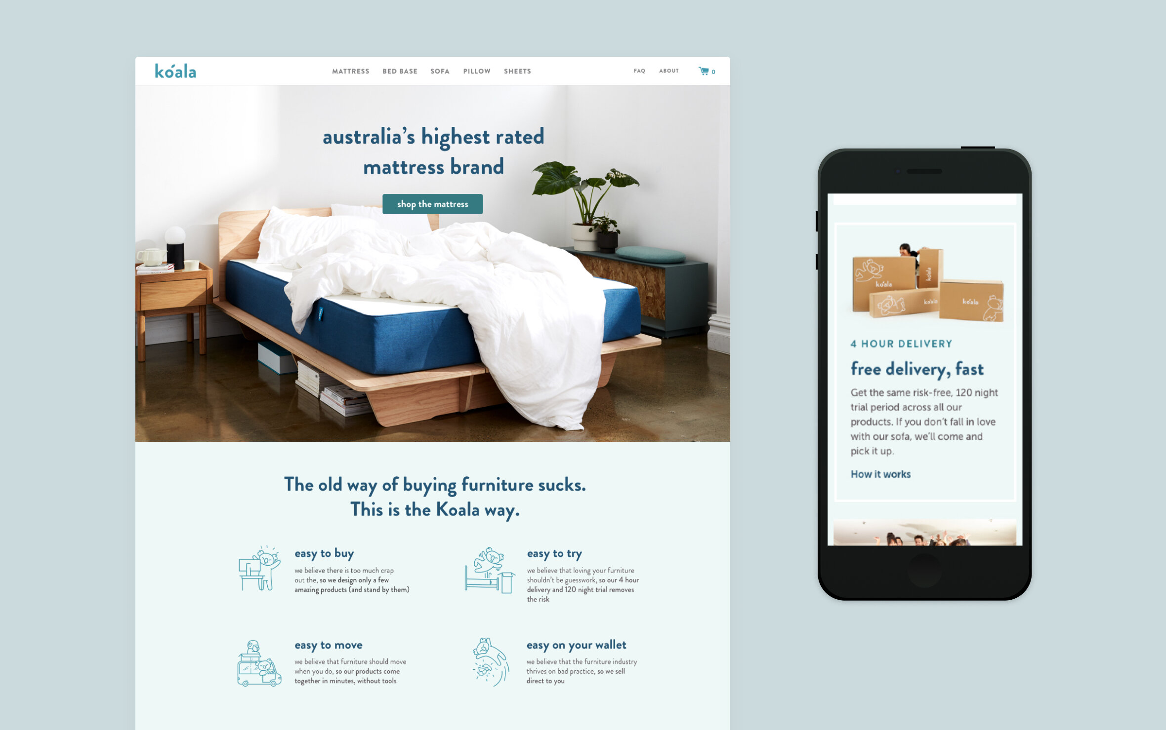
I joined Koala at the end of 2017 as the UI/UX designer for the Australian site (koala.com). I mainly worked along side the CTO, creative director, lead designer, product manager and two developers. The homepage, new product pages and help centre were launched during my time there as well as optimisations throughout the site that focused on the key goals.
Goals
To find opportunities to improve the user experience across the entire Australian site, so that we could:
increase the conversion rates of existing items
launch new items
improve the cross sell rate of products. (ie. HMW get more users to checkout with more items in their cart)
Insights and Opportunities
I conducted research to find areas for improvement, by
Reviewing Zendesk chats between the customer service team and user
Partnering with a few people from the Customer Service team to explore customer problems
Running user interviews/user testing sessions using low fi prototypes and the existing site.
Utilising tools such as Hotjar to ask questions and see where people are clicking
Categorising notes and insights from user interviews. The prototypes were a mixture of the live site on mobile and prototypes.
Key Problems
Important product details not easily found
Some of the questions that customers were calling in about were simple things that were already on the page which indicated that the information was not easily accessible enough.
Users were not scrolling that far down the page, and the average time spend on a page was less than 20 seconds.
When scanning the page for materials and what the mattress is made out of, participants struggled because there was a lot of information.
“Metro” vs “Rural” for 4 hour delivery
Koala promises 4 hour delivery for people within metro areas. However, the terms “metro” and “rural” creates confusion for people as they don’t know if the suburb they live in is considered “metro”. Many people think that “metro” only includes the city area, but 4 hour delivery can also be provided to people who live all the way in Penrith. The most commonly called about questions revolve around delivery and returns.
The FAQ page
As there were new products being introduced, the CS team were getting swamped with calls and were struggling to expand their team quickly enough.
Returns
Upon observing users communicate with the Customer Service team, it was clear that there is a lot of back and forth between customers and the CS team. There are issues with the products that are easily solvable, for example, someone slept on the wrong side of the mattress.
Design Solutions
I saw an opportunity to reduce the number of customer service calls and in turn reduce by finding out more information about what the users are communicating with us about.
Additional details section across all product pages
Information to allow users to find information immediately. Product pages changed to have important details to be immediately scannable and accessible higher up on the page on mobile devices.
Postcode checker across all product pages
Resolved this by including the postcode checker tool on product pages, so that users can check immediately, whether they qualify for four hour delivery or not.


This function already existed on a separate page but it was a bit difficult to find.
Categorised help pages
Previously, questions were not categorised by product and with the categories most asked about. Eg. Delivery and shipping. The users can now begin searching and the question should arise. The categories have been organised so that the most asked about information is at the top, and information is categorised by product.
Sections split out by categories
Searching for key words pulls up relevant questions
The desktop version has a sticky side navigation. When the user clicks on a category, the information moves to relevant category.
Clearer ‘returns’ description
On the help page, the categories have been organised so that “delivery and shipping” is the top category to be shown. We worked with the Customer Service team to write the information to be clearer and more concise. There is a different returns system for soft goods and larger furniture which was not as clear before. By asking customers up front to provide their name, order number and what product they want to return, steps were reduced: the step of the customer sending an email/message/call with not enough information and the email/message/call of the Koala team asking for more information.

Look and feel
During my time at Koala, I worked on a brand refresh. We (the design team) started working on a design system.

Style exploration

Colour exploration
Home & Product pages
I designed product pages to be modular, so that photography and text would look seamless better across devices. This enabled us to save time in development and design when we launched new products


