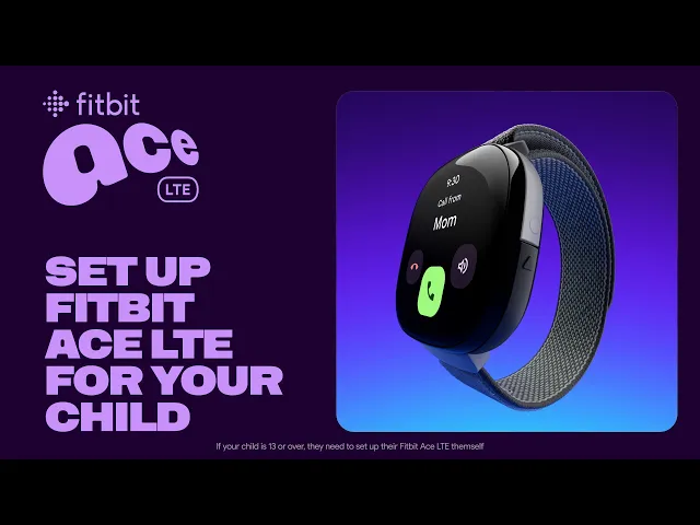

Fitbit Ace LTE is a connected smartwatch for kids, launched June 2024. When we surveyed parents during testing, 98% ranked calling and texting as a top-three feature . They were buying this watch because they wanted their child connected without giving them a phone. That context shaped everything I worked on.
I was a UX designer on the Connections team, responsible for parts of the parent-facing app - including the communication flows, trusted contacts, onboarding, and movement insights. Another UX designer on the team owned other areas.
The timeframe
Nov 2022 - Nov 2023
Role
UX designer,
Connections team
My focus areas
Onboarding, trusted contact management, communication, and movement
Working with:
Product Manager, Engineers, UX Researchers, UX writer, Motion designer
Onboarding
The problem
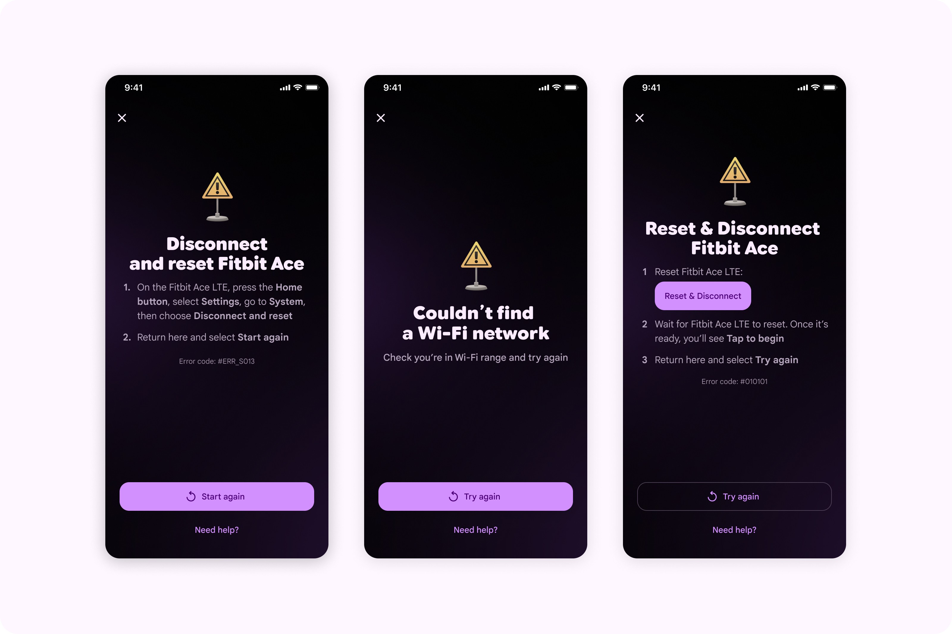
Setup felt incoherent. Parents moved in and out of P11 branding, then jumped into Google branding for payments, subscriptions, and privacy policy screens - two different visual worlds with no explanation. The progress counter made it worse: the step count was long and dishonest, not a true representation of how far in or out a parent actually was. And with no clear exits or recovery paths, any interruption - a Wi-Fi drop, a Bluetooth pairing failure, a child running off mid-setup - could leave parents stranded.
What I did
I focused on what I could control. I pushed for dark mode alignment across our screens to reduce the visual context-switching between ecosystems. I made a deliberate decision to keep Google branding on the payments and Terms of Service screens.
I replaced the rigid step counter with intermediate status states - moments like "Done!" that bought goodwill and felt honest, rather than a progress bar that was lying about where you were in the process.
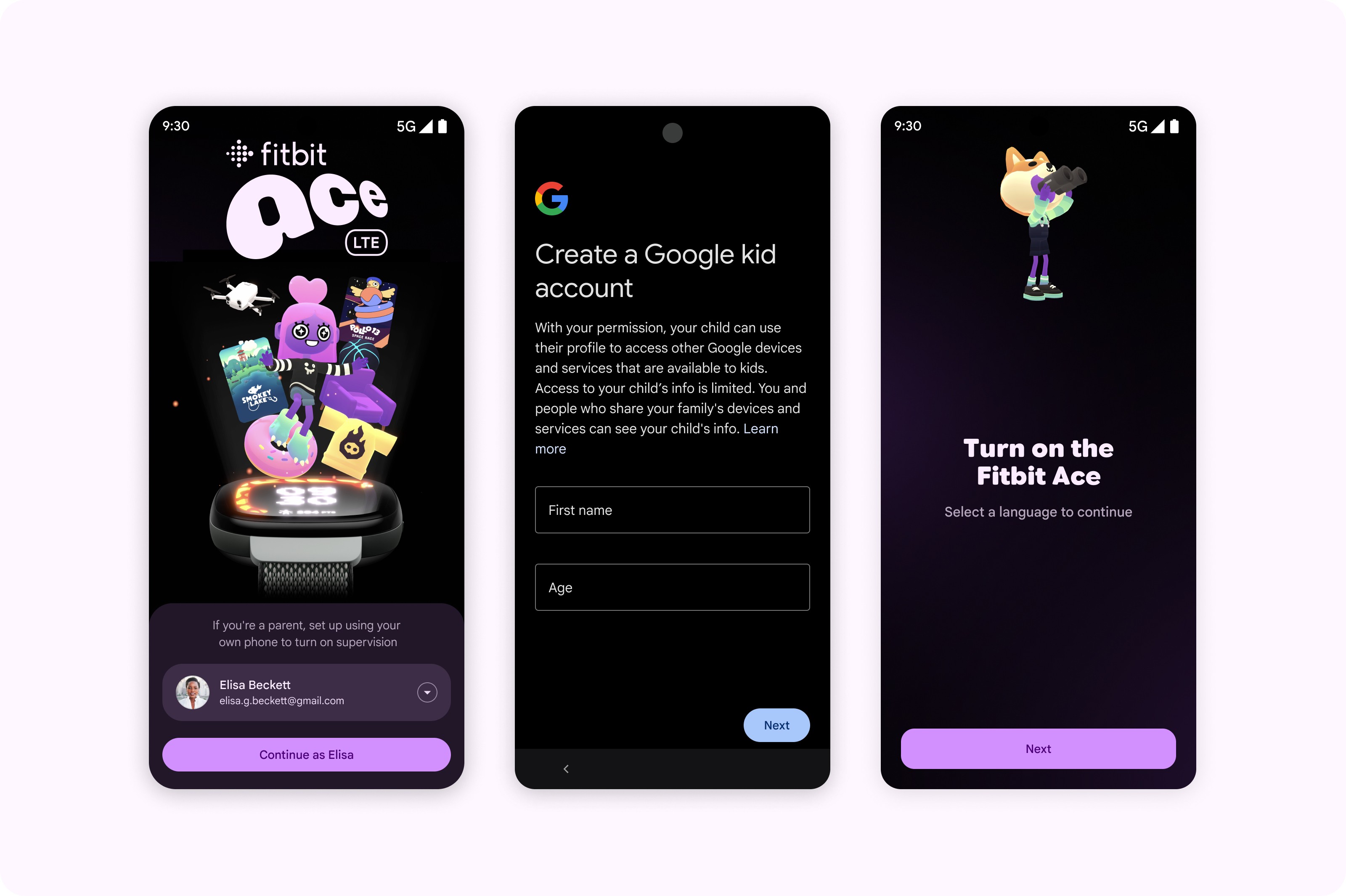
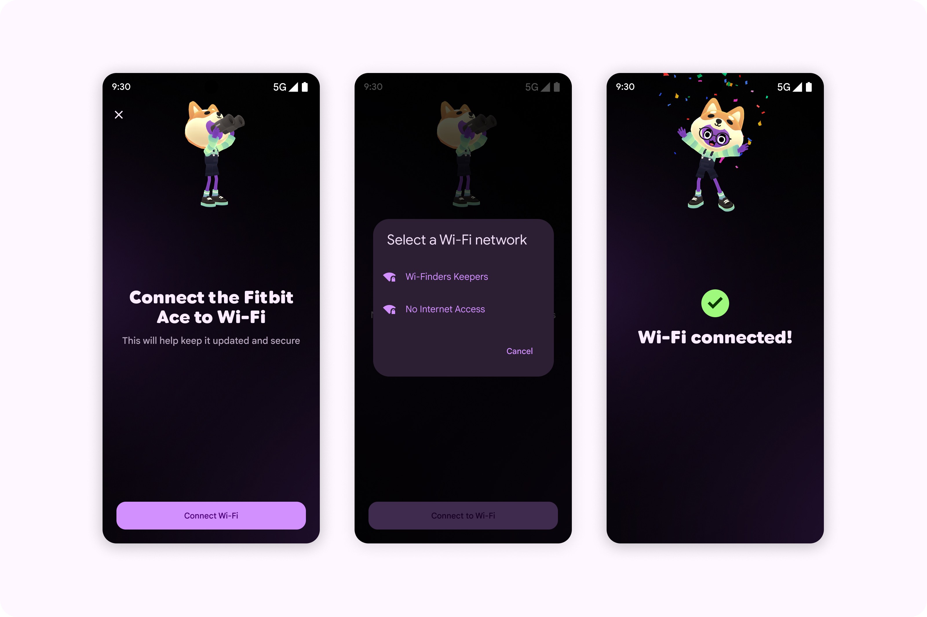
I mapped every exit and failure state and designed clear recovery paths for each one, with honest communication about the consequences of exiting - for example, that leaving mid-setup would mean starting again.
Outcome
Usability testing showed strong setup completion rates and a measurable improvement in perceived setup speed. Parents in testing noted the experience felt fast and straightforward.
Managing trusted contacts
The problem
Giving a child a connected device means deciding who can reach them. The trusted contacts system is where parents either feel in control or not.
The permission logic was complex. Trusted contacts (a grandparent, a family friend) had different permission levels to second parents, whose authority triggered changes across connected Google services.
What I did
I designed the trusted contact flow around a clear hierarchy: parents have full supervision, trusted contacts have call and message access only, with an optional emergency contact toggle. An invitation-based model meant contacts had to actively accept before being added.
For second parent invitations, I showed them clearly what they were agreeing to before they confirmed.
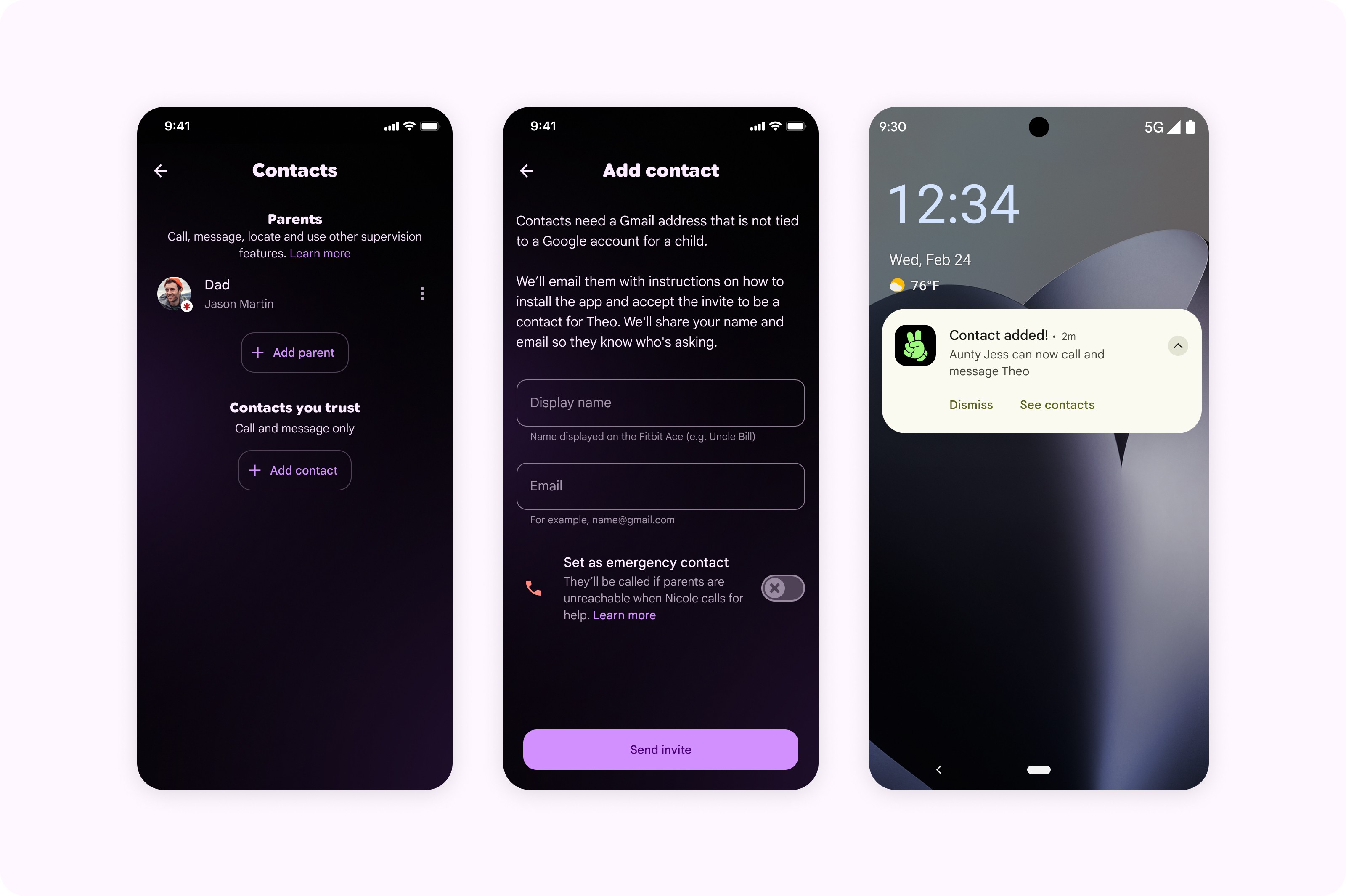
Post-launch, I designed an update to the emergency contact experience: clearer explanation of what the contact does, how the child triggers it on the watch, and a diagram of the physical button interaction. User research had shown parents had set up emergency contacts but couldn't confidently explain how they worked. That's a false sense of security. The redesign addressed a specific, validated gap.
Movement and activity
The problem
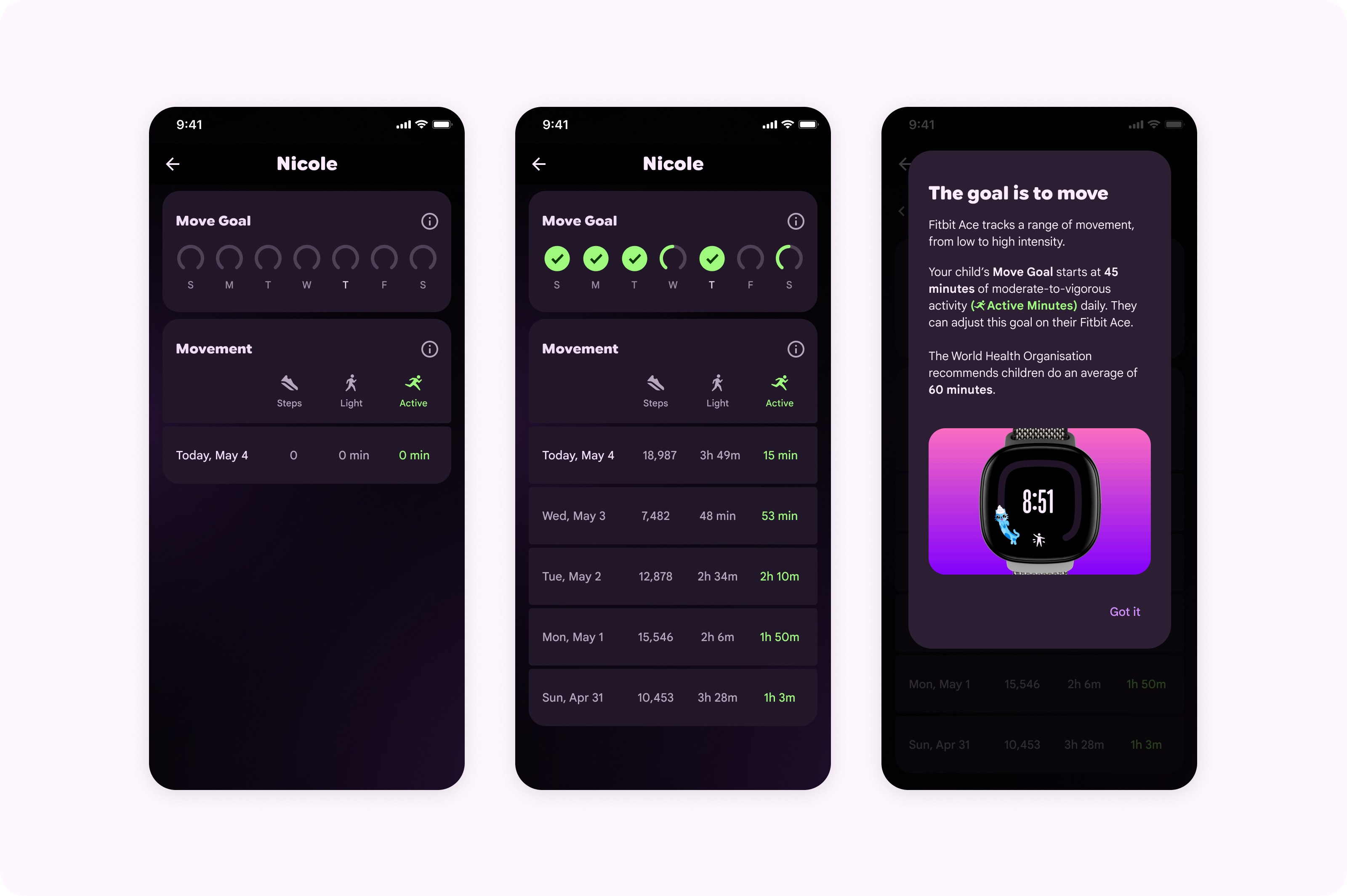
The initial scope for the activity dashboard was minimal: a step count.
What I did
A step count alone doesn't tell a parent much about their child's day. I pushed to show more: daily move goal progress, and a split between light and active minutes. It took some advocacy to get it in scope, but it shipped, and the design later made it into Fitbit's marketing material.
Learnings
Working on a zero-to-one product meant making decisions before there was any data to validate them, then using testing to course-correct quickly.
A few things I took away: when you're designing across systems you don't fully own, being clear about what you can and can't control matters a lot. Some of the biggest friction points were at the seams between teams, places no one had really thought about end to end. Post-launch signal pointed directly to what needed work next, which shaped the second round of improvements.
Advocating for the activity page scope was a reminder that design contribution isn't just what gets built - it's also what gets into scope in the first place.